2. Methods for Two Numerical Variables
In this chapter, we will discuss methods for comparing two numerical variables. We will introduce the concept of correlation and the basic idea behind a regression analysis.
2.1. Displays of Association
2.1.1. Example 7.1: Lions’ Age and Proportion of Nose Blackness
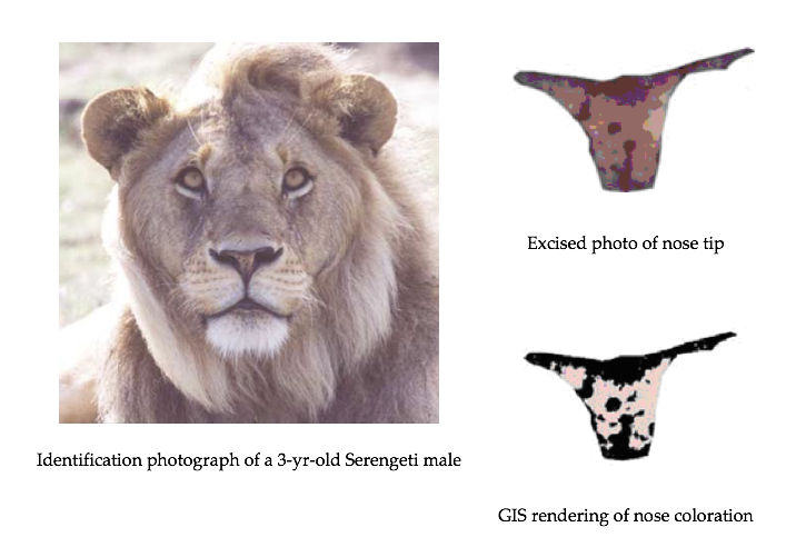
It has been suggested that the amount of black pigmentation on the nose of male lions increases with age. Whitman et al. (2004) measured the proportion of black on the noses of lions of known ages in Tanzania, East Africa. These proportions were obtained from photos and digitally analyzed, and a subset of the original data is given in the file Lions.JMP.
Close-up colour photographs were taken of known-aged lions from the Serengeti and Ngotongoro Crater, Tanzania between 1999 and 2002. Each photograph was first digitized at high resolution into a .tif file, and the fleshy part of the nose (‘nose tip’) from each image was excised using Adobe Photoshop 4.01 LE. Then, the Spatial Analyst extension of ESRI Arcview 3.2 was used to rasterize each cut-out nose tip and assign each newly created ‘grid’ a range of colour values. By limiting the colour values to either ‘black’ or ‘not black’, the nasal pigmentation pattern was ‘mapped’ and quantified for the percentage of readable pixels that contained ‘black’.
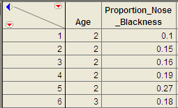
A portion of the data is shown below:
2.1.2. Association Between Two Variables
In this chapter we will be looking to identify any association between two quantitative variables. Consequently, we will be analyzing bivariate data.
- Association between two variables
- We say that there is an association between two variables when we can use the value of one variable to improve our prediction of a second variable.
- Bivariate data
- Bivariate data consists of data that includes two measurements on each individual. Note that bivariate literally means “two variables.”
2.1.2.1. Scatterplots and Displaying an Association
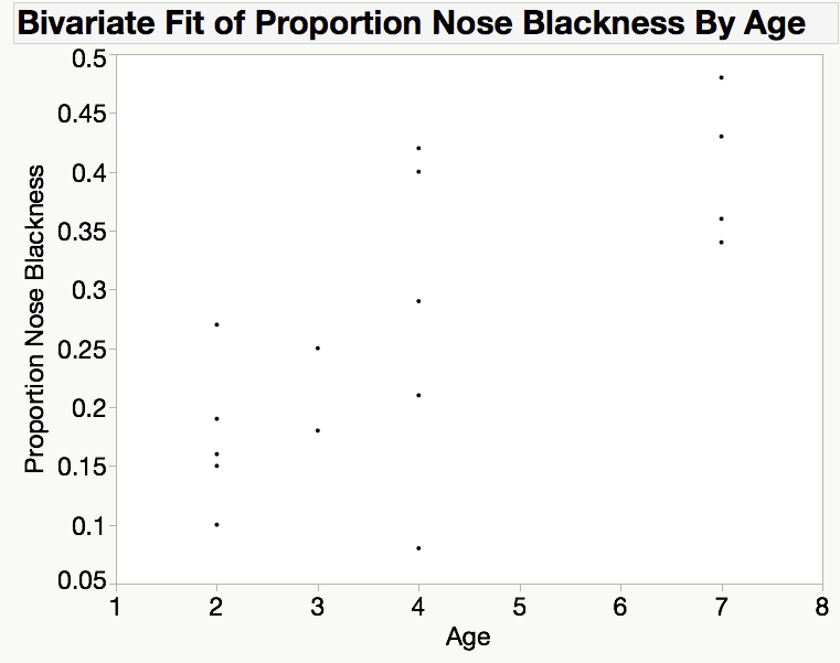
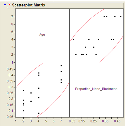
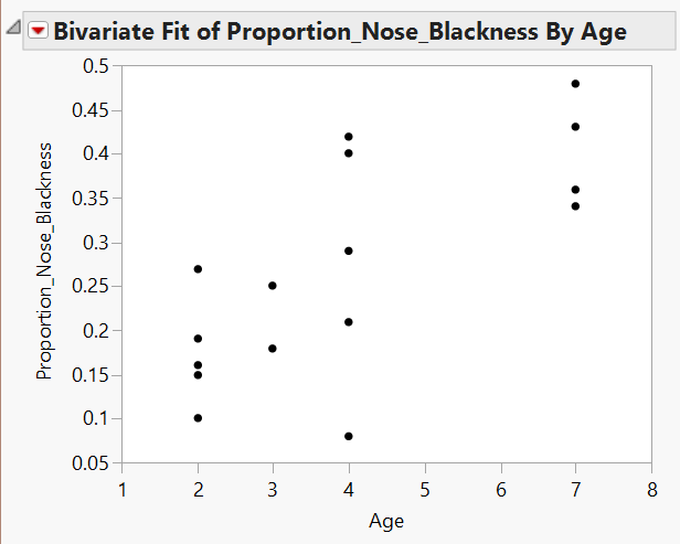
Creating a scatterplot is always the first step in determining if two variables are associated. A scatterplot is constructed by plotting a point at each of the (x,y) pairs, where x and y are the values of the x and y variables for each individual, respectively. Here is the scatterplot for the data from example 7.1, which was created in JMP.
Please answer the following questions while considering this scatterplot.
Question
- Could you use the graph to predict the proportion of nose blackness for a lion that was, say, 7 years old?
- How close do you think you could get for a randomly selected 7-year-old lion?
- Would the quality of your prediction benefit from knowing the lion’s age? In what way?
In this case a standard interpretation of this scatterplot would make note of the following.
- We see that there is a positive association, as the proportion of nose blackness tends to increase as age increases.
- The basic shape of the cloud of points is linear, or described fairly well with a line.
- Finally, we see that most of the points would be fairly close to a line drawn through the middle of the points, which indicates that this association is fairly strong.
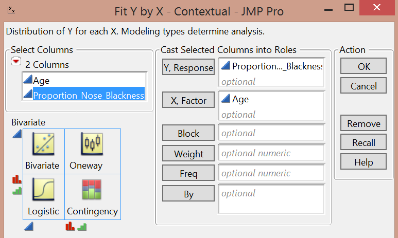
Creating a Scatterplot in JMP
To create a scatterplot in JMP, you need to
- Enter the data in a new data table (File > New > New Data Table), being careful to keep the (x,y) pairs on the same row.
- Go to Analyze > Fit Y by X and drag-and-drop the x and y variables in the correct box.
- Click OK and the scatterplot will be displayed.
In the next section, we will discuss the three components of our standard interpretation of a scatterplot, the direction, strength, and form of the association.
2.1.2.2. Describing an Association Between Variables
As always, interpretations in statistics are just as important as calculations or the construction of graphical displays of data. When describing a possible association between two variables, we will focus on the direction, strength, and form of the association.
Describing an association between variables
When describing an association between two variables, we will focus on the following attributes of association.
- Direction of association
The direction of an association is either positive or negative.
- A positive direction is indicated by a positive or direct relationship between the x and y variables, i.e. y increases as x increases.
- A negative direction is indicated by a negative or inverse relationship between the x and y variables, i.e. y decreases as x increases.
- Strength of association
A strength of association is a measure of our ability to predict the variable y using the value of the variable x.
- A strong association is an indication that we can make exact guesses at the value of y using the value of x.
- A weak association is an indication that knowing the value of the x variable does not improve our ability to guess the value of the y variable.
- Form of the association
The form of the association is a mathematical description of the basic shape suggested by the cloud of points. Examples of possible forms might be linear, quadratic, or sinusoidal. For the purposes of this course, we will describe the form in one of two ways.
- A linear form is typified by a cloud of points that is fairly straight and described well by a line.
- A non-linear form consists of a cloud of points that has a curved shape.
Note
When describing a scatterplot, we need to be careful to examine the shape of the whole cloud of points, as opposed to looking too closely at any of the points in isolation or local clusters. I like to think of this process as the fat marker method of describing the plot: If I were to cover the cloud of points by drawing a line or curve with a fat marker, what shape would I use? Did I need a curve to cover the points or was a straight line sufficient?
Check your understanding
Use the graph shown above to answer each of the following questions.
Q-149: Which of the following best describes the direction of the association shown above?
- (A) Positive
- (B) Negative
- Notice that the heights tend to rise as you scan from left to right.
- (C) No direction
- Notice that the heights tend to rise as you scan from left to right.
Q-150: Which of the following best describes the strength of the association?
- (A) Strong
- (B) Moderately strong
- Although most points would be within about 0.05, or 5%, ot the line. This is bordering on a strong prediction.
- (C) Weak
- Notice that most points would be within about 0.05, or 5%, ot the line. This is bordering on a strong prediction.
Q-151: Which of the following best describes the form of the association?
- (A) Linear
- (B) Non-linear
- There is no need to use a curve here, a line does just as well.
I find that the strength of the association is the most difficult trait to describe, especially to someone that is new to statistics. In the next section, we will introduce a summary method that will help us determine the strength of a linear association.
2.2. Correlation
2.2.1. Video Lecture on Correlation
2.2.2. Pearson Correlation Coefficient
The Pearson correlation coefficient (denoted by r) is used to describe and measure the relationship between two numerical variables. It is appropriate to use when the following are true:
- The relationship between the two variables is a LINEAR relationship
- Both variables are measured on interval or ratio scales
Formula for the Correlation Coefficient
The formula for the Pearson product-moment correlation coefficient is given below:
Calculating Correlation in JMP
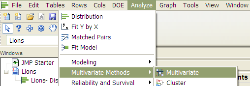
We can also use JMP to directly calculate the Pearson correlation coefficient. Select Analyze > Multivariate Methods > Multivariate.
Place both variables in the Y, columns box, and JMP returns the
following:
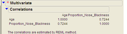
Interpreting the Pearson Correlation Coefficient
- A positive correlation coefficient indicates a positive association between the two numerical variables, and negative correlation indicates a negative association.
- The correlation coefficient is always between -1 and 1 (-1 ≤ r ≤ 1).
- Values near zero indicate a very weak relationship exists.
- Values close to 1 indicate a very strong positive relationship exists.
- Values close to -1 indicate a very strong negative relationship exists.
Questions
- What does this correlation coefficient say about the direction of the relationship between a lion’s age and its proportion of nose blackness?
- What does this correlation coefficient say about the strength of the relationship between a lion’s age and its proportion of nose blackness?
Caution
You should never use a correlation coefficient without also looking at a scatterplot of the data. Why? Consider the data in the file Anscombe_Example.JMP.
To avoid misinterpreting a correlation, always accompany the correlation coefficient with a scatterplot of the data and make sure the assumptions behind the Pearson product-moment correlation are met!
2.3. Linear Regression
2.3.1. The Least Squares Regression Line
The lecture in the following video includes a demonstration of the least squares regression line.
2.3.2. Introduction to Simple Linear Regression
Next, we will explore the basic idea behind regression analysis. A simple linear regression model describes the relationship between a numerical response variable (y) and a single predictor variable (x).
- Response variable
- The dependent variable, or the variable to be modeled.
- Predictor variable
- The independent variable used as a predictor of the response.
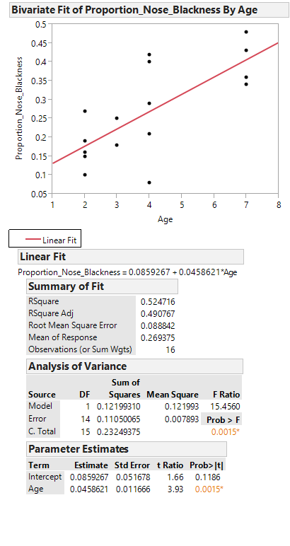
To carry out a simple linear regression analysis in JMP, you can use the Analyze > Fit Y by X menu. Place the y-variable in the Y, Response box and the x-variable in the X, Factor box.
JMP returns the following output:
Click on the red drop-down arrow and select “Fit line” to see the following output:
Task
Writing the Regression Equation
Task - Predicting the Mean of Y Given X
To use the lion’s age to predict the proportion of nose blackness, we simply use the equation. For example, predict the proportion of nose blackness for a 4-year-old lion:
Caution
Note that there are several underlying assumptions that must be met in order for us to use this regression model. These are discussed in detail in STAT 310.
2.3.3. Fitting a Regression Line in JMP
The following video illustrates the process of fitting a regression line in JMP.
2.3.4. Interpreting Slope and the y-intercept
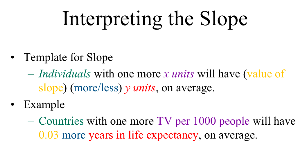
To write out an interpretation for the slope and y-intercept, we start with the standard interpretations that are taught in mathematics. Recall that the slope is the amount of change in y when adding one unit to x. Since the relationships in regression are rarely perfect, but instead describe a general tendency, we change this interpretation as follows.
The standard interpretation of the slope of a regression line
The slope of the regression line is the average amount of change in y when adding one unit to x.
It is, as always, important to add the context to our interpretations and the following figure shows a basic template for writing about the slope, along with an example.
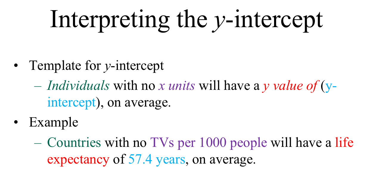
The y-intercept is the value of the y variable when x is zero. Adjusting to the inexact nature of regression, we get the following interpretation of the y-intercept.
The standard interpretation of the y-intercept of a regression line
The y-intercept of the regression line is the average value of y when the x variable is zero.
The following figure contains a template for adding context to our interpretation, along with an example of the application of the template.
We need to be careful to only apply these interpretations when they are viable. In the case of the slope, it is important that the association is fairly linear. Non-linear associations will have a variable rate of change, and assigning a fixed amount of change in y for a given value of x would be misleading.
In terms of the y-intercept, we need to assure that an x value of zero is meaningful. If x represents the profit of a business, a value of zero is meaningful as it is definitely conceivable for a business to have a profit of zero. On the other hand, if the x values represent the heights of people, then an x value of zero is nonsensical: A height of zero is inconceivable.
Another consideration when applying these interpretations is the scope of the data. We have no idea what is happening outside our data window and it would be a mistake to assume that the pattern that we see will continue past the largest and/or smallest data values. For example, the slope might start to change if we push past our maximum y-value. Similarly, if we do not have any data with x values around zero, we should not interpret the value of the intercept.
To summarize, use the following advice before interpreting the slope or intercept.
Interpreting the slope of the regression line is viable when ...
- the x value is between the minimum and maximum values of x
- the association is fairly linear.
Interpreting the y-intercept is viable when ...
- there is data with x values around zero.
- a x value of zero is meaningful.
2.3.5. Another Example
2.3.5.1. Example 7.2
Consider the data found in the file FEV.jmp. This data is from an investigation which concerns measuring the subjects’ respiratory function, as well as whether the subjects themselves smoke. In this problem, the measured outcome of interest is forced expiratory volume (FEV), which is, essentially, the amount of air an individual can exhale in the first second of a forceful breath. The file includes measurements on the following variables:
- FEV (liters)
- Age (years)
- Height (inches)
- Gender (M/F)
- Smoking Status (Y/N)
One primary question of interest is how pulmonary function differs between smokers and nonsmokers. To investigate this question, we will begin by utilizing some descriptive methods and inferential methods discussed earlier in the semester.
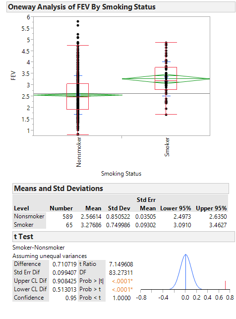
Questions
- What do these summaries indicate concerning the relationship between smoking and lung function?
- Do you really believe that this is the case? If not, can you think of any potential problems with either the study itself or our descriptive methods which might cause the data to display this relationship?
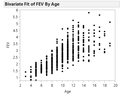
Next, let’s consider another variable in the study, Age. We can use a scatterplot to describe how FEV changes across Age:
Let’s calculate the correlation coefficient and the regression line in JMP:
Questions
- Interpret the intercept of the regression line in the context of the problem.
- Interpret the slope of the regression line in the context of the problem.
- What can you say about the relationship between Age and lung function? How does this affect the summaries we observed at the beginning of this example?
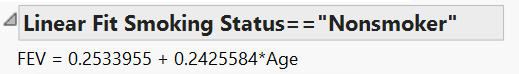
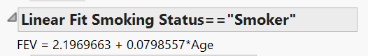
Finally, let’s examine the relationship between Smoking Status and FEV after accounting for Age. From the red drop-down arrow next to “Bivariate Fit of FEV by Age” select Group by… Smoking Status. From the same drop-down menu, select Fit Line. This requests that JMP fit a regression line for both smokers and nonsmokers. Your scatterplot should appear as follows.
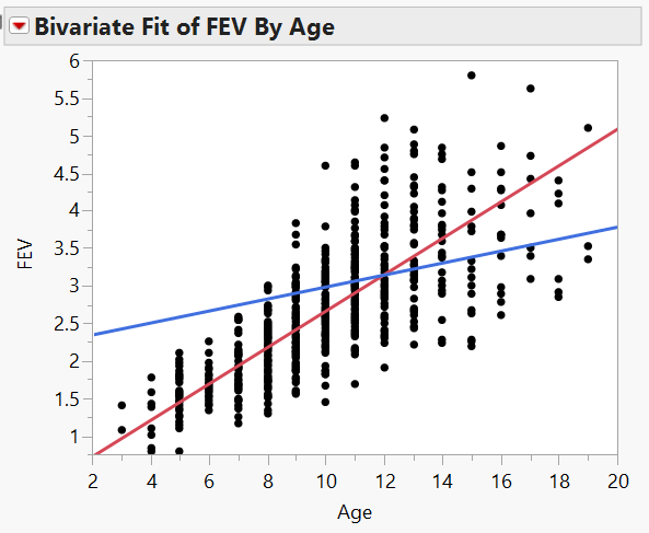
Questions
- Does it appear that the rate at which a nonsmoker’s FEV increases with Age differs from the rate at which a smoker’s FEV increases with Age? Explain.
- Based on this information, do you think it is fair to examine the relationship between FEV and Smoking Status without accounting for Age? Explain.
Check your understanding
The images shown above was the JMP output for fitting FEV vs. age. Use it to answer the following questions.
-
Q-152: What is the correlation coefficient for these data?
- (A) 0.432
- Line up FEV and Age in the correlation table.
- (B) 0.222
- Line up FEV and Age in the correlation table.
- (C) 0.757
- (D) 1.000
- Line up FEV and Age in the correlation table.
-
Q-153: Based on the correlation coefficient, how would you rate the strength of this linear association?
- (A) Strong
- (B) Moderately Strong
- A correlation coefficient over about 0.7 indicates a strong relationship
- (C) Weak
- A correlation coefficient over about 0.7 indicates a strong relationship
-
Q-154: Based on the correlation coefficient, determine the direction of the association.
- (A) Positive
- A positive correlation coefficient indicates a positive direction.
- (B) Negative
- A negative direction is indicated by a negative correlation coefficient.
- (C) No direction
- No direction is indicated by a correlation coefficient close to zero.
-
Q-155: What is the slope of the least-squares regression line?
- (A) 0.432
- The slope is the coefficient that is multiplied by Age
- (B) 0.222
- (C) 0.757
- The slope is the coefficient that is multiplied by Age
- (D) 1.000
- The slope is the coefficient that is multiplied by Age
-
Q-156: What is the y-intercept of the least-squares regression line?
- (A) 0.432
- (B) 0.222
- The y-intercept is the constant in the equation.
- (C) 0.757
- The y-intercept is the constant in the equation.
- (D) 1.000
- The y-intercept is the constant in the equation.