Chapter 2 Part 2
Using JMP to Find p-values for the Binomial Exact Test
Analyzing a Distribution with Raw Data
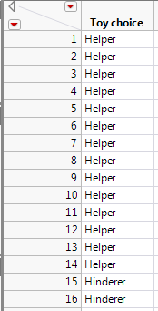
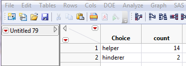
Earlier, we used Excel to calculate binomial probabilities and to find the p-value associated with the binomial exact test. This test is also easily implemented in JMP when given the raw data. For example, the data from the Helper/Hinderer example could be entered into JMP as follows:
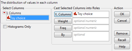
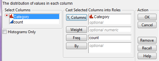
To get the test statistic and p-value in JMP, select Analyze > Distribution. Enter the following:
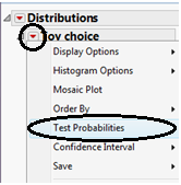
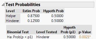
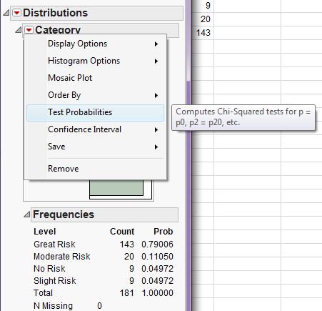
On the output that appears, select “Test Probabilities” from the red drop-down arrow next to the variable name:
Enter the following:
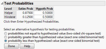
Click “Done” and JMP should return this output:
An Alternative Method of Setting up the Data Sheet
You can also set up the data as shown below:
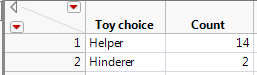
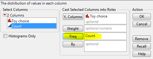
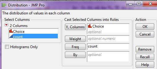
If you provide the summarized data to JMP as shown above, then enter the following after selecting Analyze > Distribution:
From here on out, the steps are the same as shown on the previous page.
On the output that appears, select “Test Probabilities” from the red drop-down arrow next to the variable name:
Enter the following:
Click “Done” and JMP should return this output:
Confidence Interval for a Proportion
When carrying out hypothesis tests, we are testing claims about population parameters. Sometimes, however, our goal is to estimate a parameter of interest. Statisticians typically do this with a confidence interval, which is simply a range of likely values for the parameter of interest. The big difference between hypothesis testing and confidence intervals is as follows: the construction of a confidence interval does NOT require any hypotheses concerning our population parameter of interest.
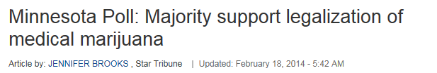
Example 2.5: Star Tribune Poll Regarding Legalization of Medical Marijuana
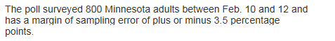
In February of 2014, a Star Tribune Minnesota poll asked a random sample of adults in Minnesota, “Do you support or oppose legalizing marijuana for medical purposes in Minnesota?” Of the 800 adults surveyed, 408 (51%) answered that they would support this.
Source: http://www.startribune.com/politics/statelocal/245910931.html
Questions:
Ultimately, the Star Tribune conducted this poll because they wanted to estimate the proportion of adults in Minnesota that felt (at the time of the survey) that medical marijuana should be legalized. Keep this in mind as you answer the following questions.
- What is the population of interest?
- What is the parameter of interest?
- What is the sample?
- What is the sample statistic of interest?
Based on the results of this poll, our best guess for the proportion of all Minnesotans that feel medical marijuana should be legalized is = 408/800 = 51%. This is called a point estimate.
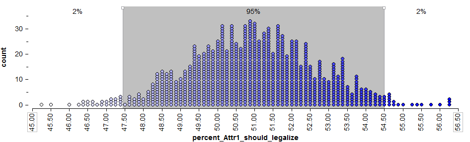
We know, however, that if a different sample of 800 Minnesotan adults had been polled, this point estimate would likely change. So, instead of using only this point estimate, we’ll also use statistical methods to estimate the parameter of interest with a range of likely values (this range is called the confidence interval). To get this range of likely values, we’ll start with our point estimate (i.e., the sample statistic, = 51%). This is our best guess so far. Then, we can use Tinkerplots to get an idea of how much we expect this statistic to change from one random sample to the next because of natural sampling variation. The distribution of sample proportions obtained by repeated sampling is shown below.
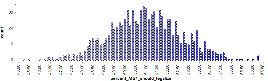
To get a 95% confidence interval for the parameter of interest, we find both the lower endpoint and the upper endpoint that separate the “middle” 95% of this distribution from the outer 5%.
Questions:
- Find the lower and upper endpoints for a confidence interval for the parameter of interest, π = the proportion of all Minnesotan adults that felt medical marijuana should be legalized.
- Interpret this confidence interval.
The Wald Interval
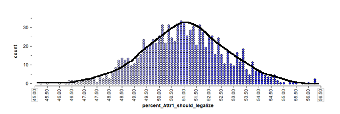
The previous discussion involving Tinkerplots helps us understand the intuition behind a confidence interval. Note that a statistician would not necessarily compute a confidence interval in this way. Instead, to calculate a confidence interval for a proportion, a statistician often makes use of the normal distribution (i.e., the bell-shaped curve). Note that the normal curve approximates the distribution of sample proportions obtained from Tinkerplots quite well:
If we can reasonably assume that this will be the case (later, we’ll discuss certain conditions under which the normal approximation may not be reasonable), then we don’t even need the “dots” from Tinkerplots to find the middle 95%. We can use mathematical theory and a procedure known as the Wald interval, instead.
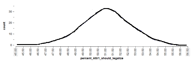
To find the endpoints for a 95% confidence interval, we need only find the values on the x-axis of the above graph that separate the middle 95% from the rest.
The Wald Method
We can use Wald’s method to do this with the following steps:
- Start with the point estimate, \hat{\pi}:
- Calculate the standard error associated with this point estimate:
Calculate the margin of error: This is defined as 1.96 standard errors for a 95% confidence interval.
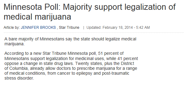
\[1.96\sqrt{\frac{\hat{\pi}\left(1 - \hat{\pi}\right)}{n}}=\]Comment: See the following excerpt from the Star Tribune article.
Find the endpoints of the confidence interval:
Note that if you desired to construct a 90% or a 99% confidence interval, instead, the formula would change slightly. These formulas are shown in the table below.
Formulas for 90%, 95%, and 99% Confidence Intervals for a Proportion
- For a 90% confidence interval, the margin of error is defined as 1.645 standard errors. The 90% confidence interval is then given by \hat{\pi} \pm 1.645\sqrt{\frac{\hat{\pi}\left(1 - \hat{\pi}\right)}{n}}.
- For a 95% confidence interval, the margin of error is defined as 1.96 standard errors. The 95% confidence interval is then given by \hat{\pi} \pm 1.96\sqrt{\frac{\hat{\pi}\left(1 - \hat{\pi}\right)}{n}}
- For a 99% confidence interval, the margin of error is defined as 2.575 standard errors. The 99% confidence interval is then given by \hat{\pi} \pm 2.575\sqrt{\frac{\hat{\pi}\left(1 - \hat{\pi}\right)}{n}}.
Questions::
- What happens to the margin of error when the confidence level decreases? For example, what will happen if we were to construct a 90% confidence level instead of 95%?
- What will happen to the margin of error and the confidence interval if we increase the level of confidence?
- What will happen to the margin of error if the sample size increases? Explain.
- Recall the headline used by the Star Tribune and one of the first
sentences of their article.
 Carry out the binomial exact test to determine whether the poll
provides evidence that this is really the case.
Carry out the binomial exact test to determine whether the poll
provides evidence that this is really the case.
| Null Hypothesis | Ho: |
|---|---|
| Alterative Hypothesis | Ha: |
| p-value | |
| Conclusion |
- Does the confidence interval agree with the decision at which you arrived using the hypothesis test? Explain.
Recall that in this study, 14 of the 16 ten-month-old infants chose the helper toy. Suppose that the researcher wants to estimate the parameter of interest, π = the proportion of all ten-month-olds that would choose the helper (you could also think of this as π = the probability that a randomly selected ten-month-old would choose the helper toy).
First, check the conditions to determine whether the Wald method is appropriate.
For illustrative purposes only, use Wald’s method to obtain a 95% confidence interval for π.
- Start with the point estimate, \hat{\pi} = \frac{14}{16}=0.875:
- Calculate the standard error associated with this point estimate:
Calculate the margin of error: This is defined as 1.96 standard errors for a 95% confidence interval.
\[1.96\sqrt{\frac{\hat{\pi}\left(1 - \hat{\pi}\right)}{n}}\approx1.96*0.083=0.162\]Comment: See the following excerpt from the Star Tribune article.
Find the endpoints of the confidence interval:
Confidence Intervals in JMP
Note that we could also use JMP to find this confidence interval. JMP uses what is known as the score method instead of Wald’s method, which would be more appropriate in this case.
Select Analyze > Distribution and enter the following:
Then, click the red drop-down arrow next to the variable name (in this case “Choice”) and select Confidence Interval > .95.
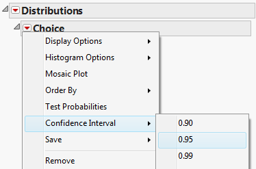
JMP returns the following:
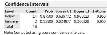
Interpret this confidence interval.
Note
The hypothesis test for this problem provided evidence that the true population parameter was greater than 50%. The confidence interval tells us this and more…
HOW MUCH GREATER it is!
Inference for a Categorical Variable with More than Two Categories
The analyses we have completed up to this point in the semester were for a single categorical variable with only two outcomes. For example, in the helper/hinderer study, the babies were choosing either one toy or the other. In the gender discrimination example, each employee selected for management was either male or female. Next, we’ll consider problems involving a single categorical variable which has more than two categories.
The Minneapolis Police Department posts regular updates on crime statistics on their website. A colleague of mine has collected this data for the past few years on all neighborhoods in Minneapolis. A portion of the data set and the precinct map are shown below.
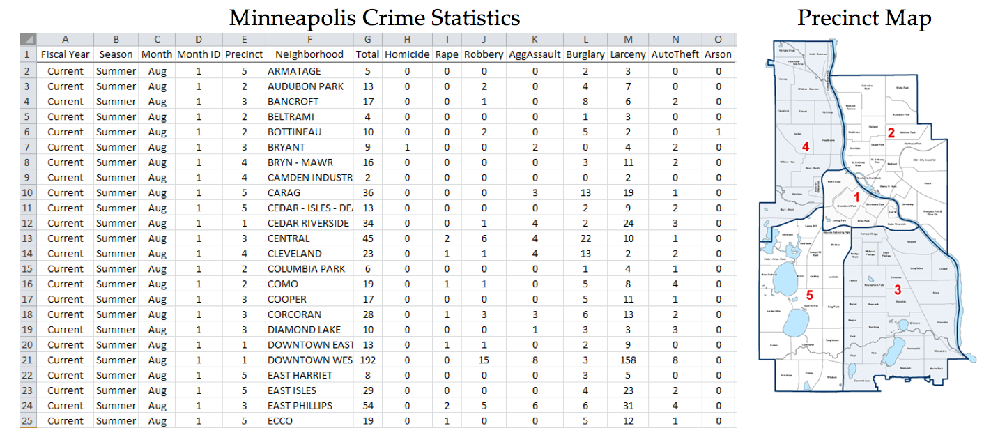
Source: http://www.minneapolismn.gov/police/crime-statistics/
Suppose the police chief for Precinct #2 has received a complaint from a permanent resident who lives in a neighborhood near the University of Minnesota. This resident has asked for additional patrol to take place in his neighborhood as he believes that crime rates vary over the course of the year.
Research Question:
Is there evidence to suggest that crime patterns in the University of Minnesota neighborhood differ over the four seasons of the year?
Crime rates are reported by month, so we will use the following definitions for the Seasons:
- Fall: September, October, and November
- Winter: December, January, and February
- Spring: March, April, and May
- Summer: June, July, and August
Crimes classified as Murder, Rape, Robbery, Aggravated Assault, Burglary, Larceny, Auto Theft, and Arson are used in reporting the Total.
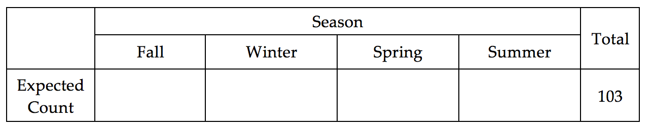
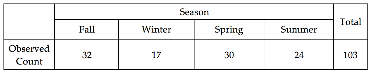
The Minneapolis Police Department reported that a total of 103 crimes occurred in the University of Minnesota neighborhood last year.
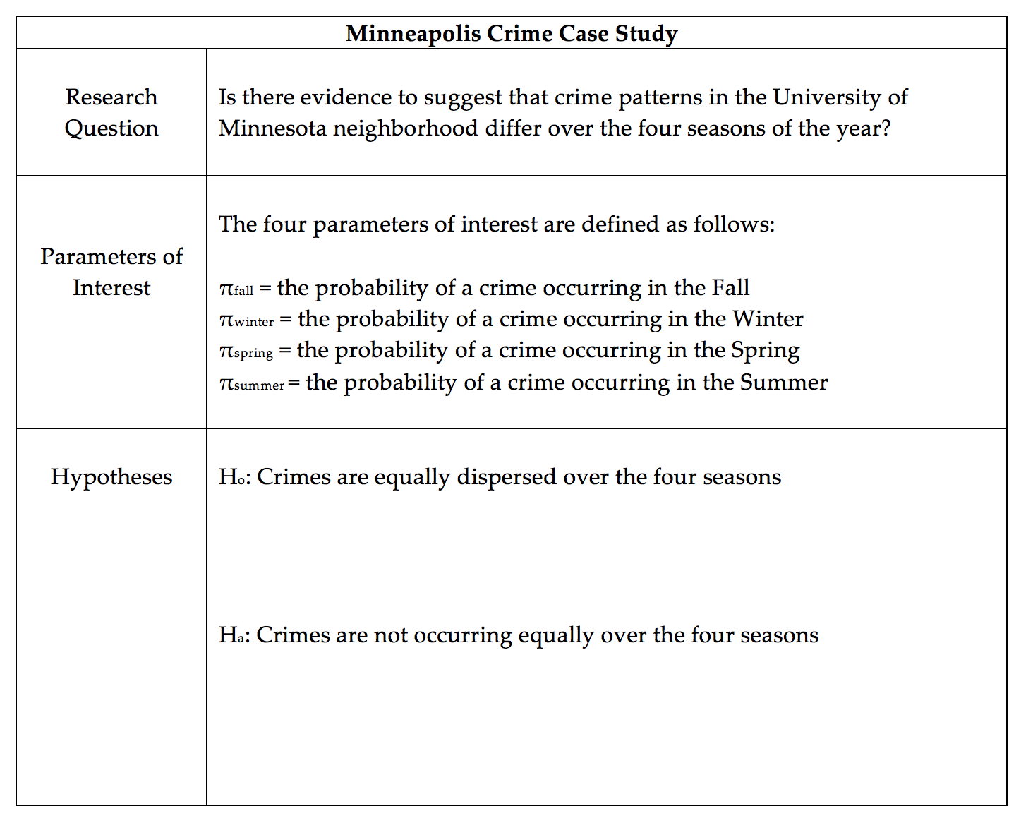
The approach we take here to address the research question is very similar to what we have done previously. We will assume the crime patterns are occurring equally across the four seasons (i.e., that the null hypothesis is true) and then get a good idea of what outcomes we would expect to see if this were really the case. Then, we will check to see if the observed outcomes given in the data are consistent (or inconsistent) with what we expected to see under the null hypothesis. If the observed data are inconsistent with the outcomes expected under the null, then we have sufficient statistical evidence to say crime rates vary across the four seasons.
Questions:
- Find the expected number of total crimes for each season under the assumption that crimes are occurring equally over the four seasons. How did you obtain these values?
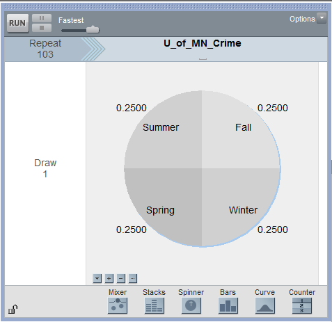
Note that we must allow for some slight variations in the crime patterns over the four seasons because we do not anticipate the numbers to come out exactly at the expected number for each season. Over repeated samples, slight variations will occur in the crime patterns. We could use Tinkerplots to give us an idea of how much deviation from the expected counts we should anticipate.
Questions
- Why is the spinner set up with 25% for each season? Explain.
- Why is the repeat value set to 103? Explain.
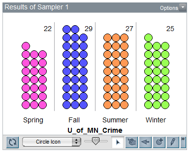
Suppose that after running the first trial of the simulation, you obtained the following results:
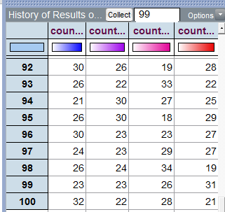
To keep track of the count for the number of crimes in each season over repeated trials of this simulation, we can right-click on each season’s count and select Collect Statistic. Note that this needs to be repeated for each season. Tinkerplots then creates a table as follows:
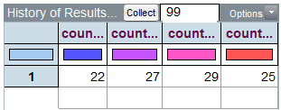
Note that I have placed 99 in the Collect box so that we end up with a total of 100 simulated trials.
The following plot shows what outcomes our simulation study suggests we would anticipate for each season, assuming that crimes are equally likely to occur in any of the four seasons.
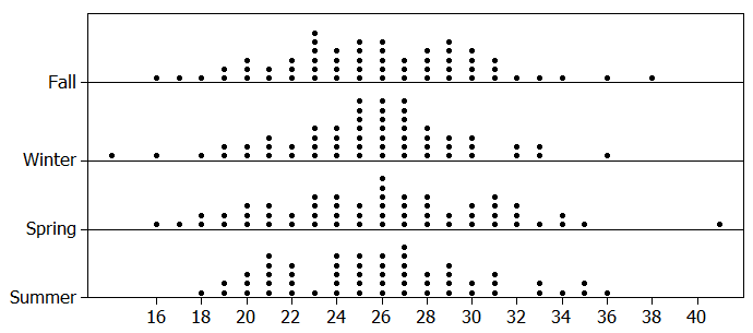
Next, consider the actual crime statistics for the University of Minnesota neighborhood for the past year.
Plot these observed outcomes on the above graph. What do you think? Recall that our goal is to determine whether this observed result is consistent or not with what our simulation tells us we should see if there is really no difference in the crime rate across seasons.
Questions:
- Why is it more difficult to determine whether or not our data is considered an outlier in this situation than in the problems we dealt with previously?
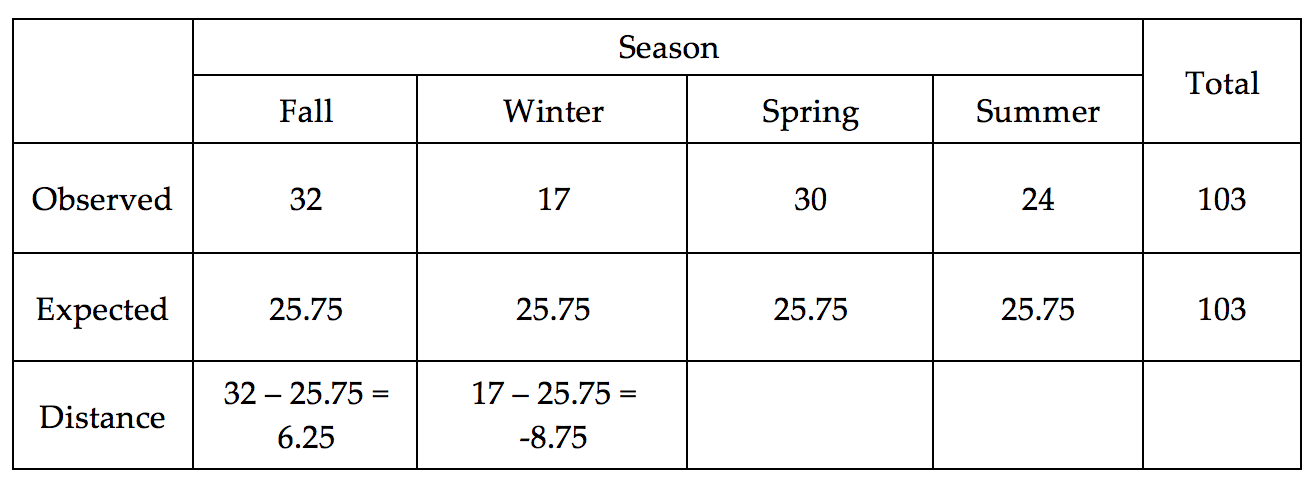
One way to address this problem is to consider the overall distance between the Observed and Expected counts for all four seasons combined. This is shown below.
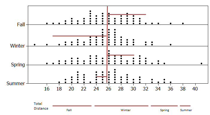
Compute the distance from the Observed to the Expected for the Spring and Summer seasons.
Questions:
- Find the sum of the Distance for all four seasons. What is this total distance? Does this value make sense for total distance? How might we overcome this issue?
So that the negative distances do not cancel out the positive ones, we will square each distance before adding them up. Note that the absolute value could have been used, as well, but the statistical hypothesis testing procedure we will soon be discussing uses the squared distances, so that’s what we’re considering here.
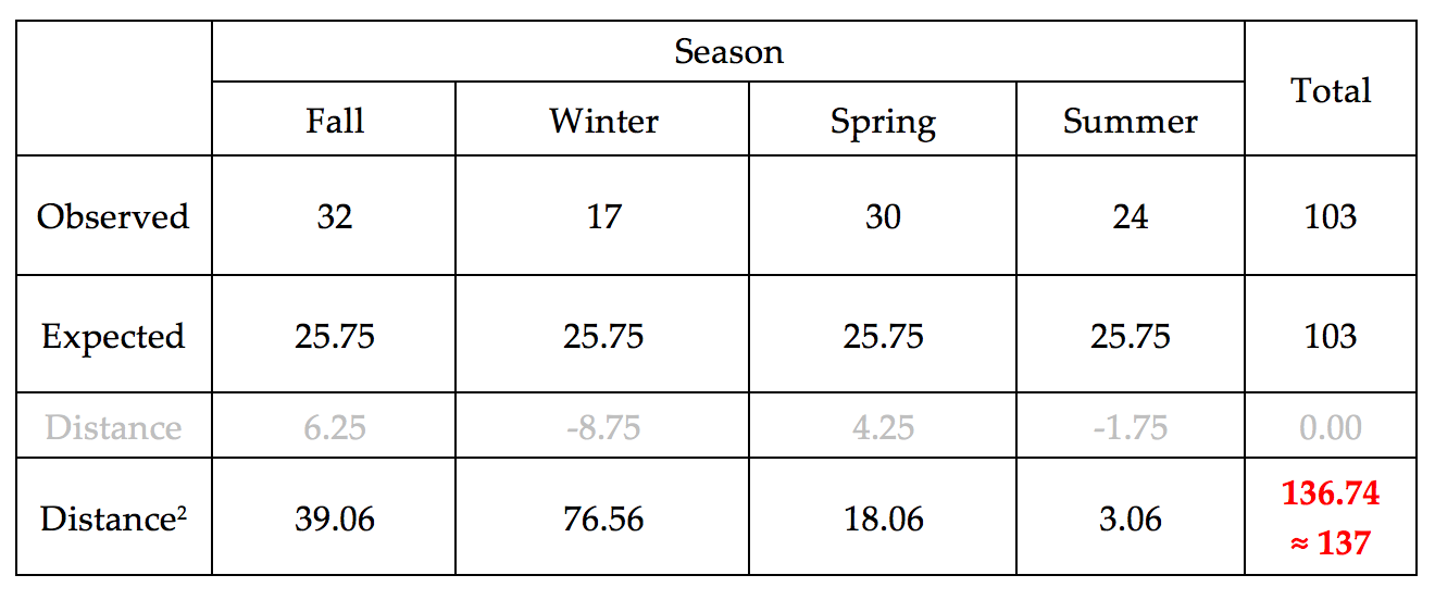
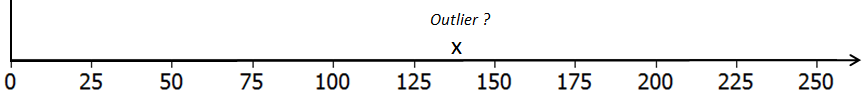
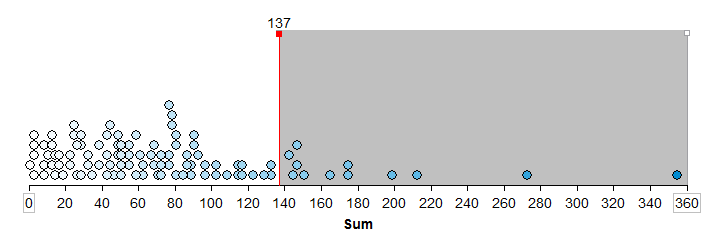
The total squared distances summed up across all four seasons is about 137. Note that we cannot determine whether or not this 137 is an outlier using our previous graphs because the previous graphs considered each season individually. Our new measure is the squared distance between the Observed and Expected counts summed over four seasons, so we now need a new graph that shows this value for all of our 100 simulated results in Tinkerplots to determine whether or not 137 is an outlier.
Questions:
What would a value of 0 imply on the above number line? Explain why a value less than 0 is not possible when the distances are squared and summed across the categories.
What would a large value imply? Is this evidence for or against the original research question? Explain.
- When squared distances are computed and summed across all categories,
the appropriate test is an upper-tailed test. Explain why this is the case.
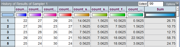
In Tinkerplots, a formula can be used in the History table to compute the squared distance between the simulated outcome for a single trial and the expected count for each season. These squared distance values are then summed across the four seasons.
The outcomes from the first 5 trials are shown here.
A graph of the total squared distances from all 100 trials in Tinkerplots is given below. The p-value is determined using the proportion of dots greater than or equal to 137, the “observed outcome” from the study.
Questions:
- What is the approximate p-value from the above graph? What is the appropriate statistical decision for our research question?
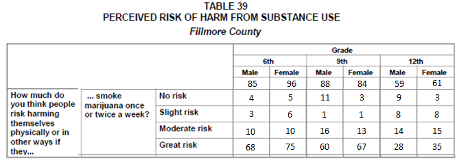
The Minnesota Student Survey (MSS) is a survey administered every three years to 6th, 9th, and 12th grade students. It is also offered to students in area learning centers and to youth in juvenile correctional facilities. This survey is an important vehicle for youth voice, as school districts, local public health agencies, and social services agencies use the survey results in planning and evaluation for school and community initiatives and prevention programming.
Questions are related to both the home and school life of students. Topics include family relationships, feelings about school, substance use, wellness activities, and more. Participation in the survey is voluntary, confidential, and anonymous.
For this analysis, we will consider Question # 105 from this survey. Data has been collected for Fillmore County, which is in Southeastern Minnesota. Fillmore County (population = 20,866) consists of several small rural communities.
The following data was obtained from the Minnesota Department of Education website.
Source:
Minnesota Department of Education, http://education.state.mn.us/MDE/Learning_Support/Safe_and_Healthy_Learners/Minnesota_Student_Survey/index.html
Information regarding the historical patterns for Grade 6 students from across the state of Minnesota is given here and will be used for comparisons.
Historical Patterns for Grade 6 Students Across the Entire State of Minnesota:
- About 3 out of 4 students in Grade 6 respond to the third part of this question (i.e., “smoking marijuana once or twice a week” ) with “Great Risk”
- A very small percentage, only about 1%, respond to the third part of this question with “No Risk”
- The remaining students typically divide themselves between “Slight Risk” and “Moderate Risk” when responding to the third part of this question.
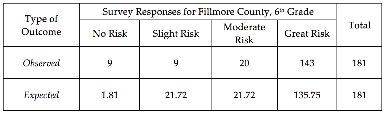
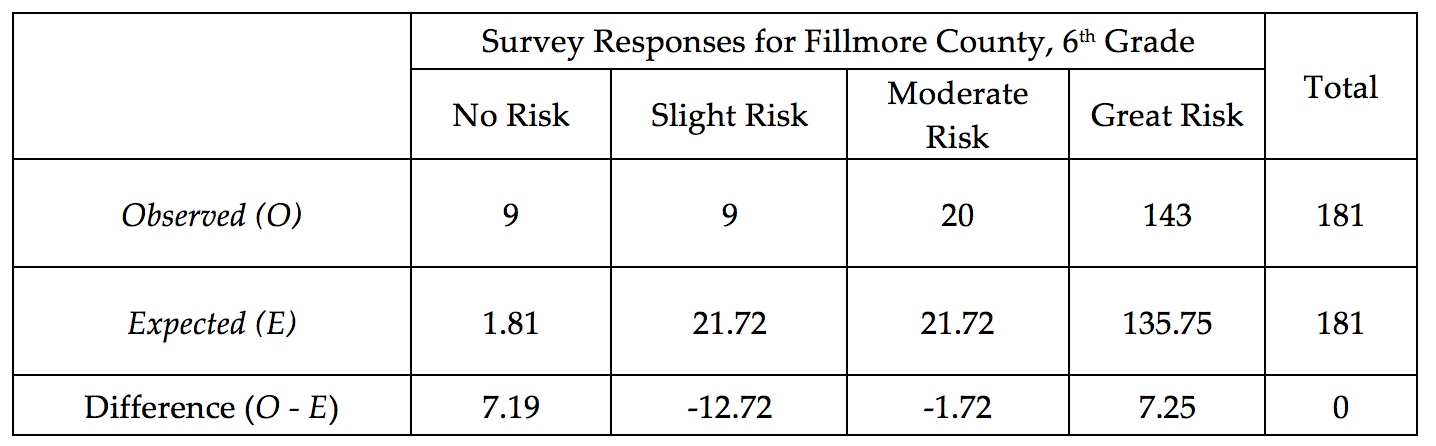
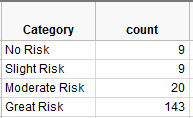
Consider the following table. The first row of this table contains the Observed Outcomes for Grade 6 students from Fillmore County (male and female tallies were combined). The second row contains the Expected Outcome (under the null hypothesis) for each of the possible survey responses.
Questions:
- The value in the first row and second column is 9 (i.e. Observed count in the Slight Risk category). Explain where this number came from. What does this value represent?
- What does the Total value for the Observed row represent?
- The value in the second row and second column is 21.72 (i.e. Expected count in the Slight Risk category). Explain where this number came from. How was it computed? What does this value represent?
- Why is the Expected count for the Great Risk category so much higher than the others?
- Suppose your friend computes the following percentages: No Risk: 9/181 ≈ 5%; Slight Risk: 9/181 ≈ 5%; Moderate Risk: 20/181 ≈ 11%; and Great Risk: 143/181≈ 79%. Your friend then makes the following statement: “There is enough evidence for the research question because these percentages are different from the historical percentages (i.e., No Risk = 1%, Slight Risk = 12%, Moderate Risk = 12%, and Great Risk = 75%).” Why is this statement statistically incorrect? Explain.
Once again, in an effort to understand the amount of acceptable deviation from the expected, we can consider the distance between the Observed and the Expected outcome for each of the possible choices for this question.
We discussed earlier the fact that we need to square the differences (i.e., distances) before summing because otherwise the positive and negative values cancel each other out. Upon careful inspection of these differences, there is another problem that also needs to be addressed.
In particular, notice that the difference in the Great Risk category is 7.25, and the difference in the No Risk category is slightly smaller at 7.19. However, these distances alone fail to take into consideration the scale of the expected values. The following Test Statistic accounts for the scale of the expected counts:
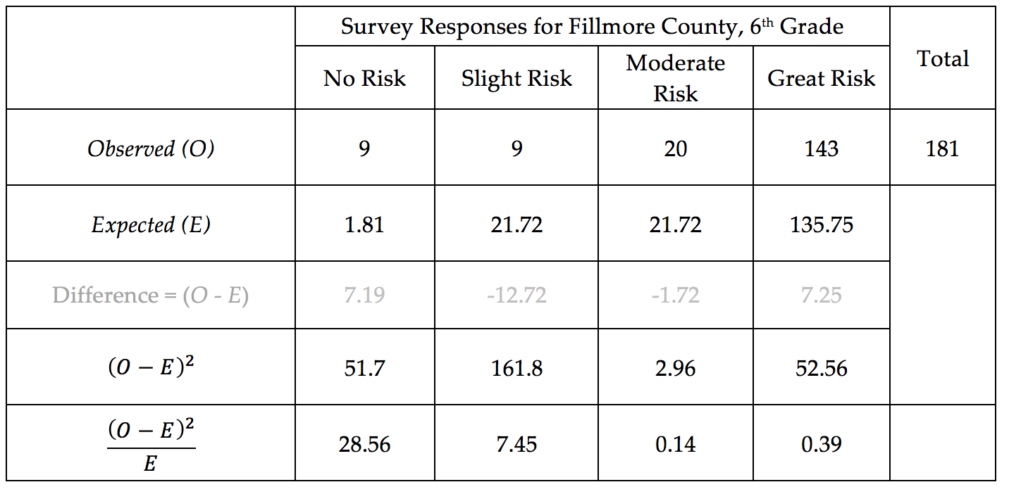
The Test Statistic for this analysis would be:
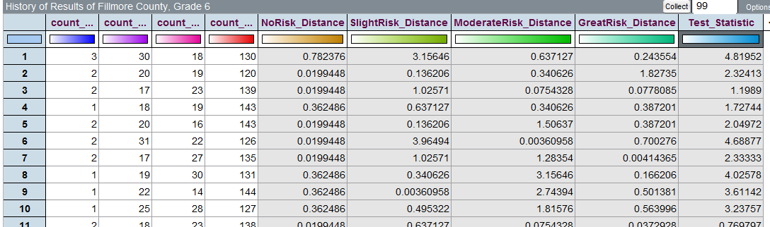
Similar to what we have done in the past, now we must determine whether or not the Test Statistic from the observed data would be considered an outlier under the null hypothesis. Tinkerplots can be used to compute the Test Statistic over repeated samples under the null hypothesis. The outcomes from the first 10 trials are shown here (see the far right column in table below).
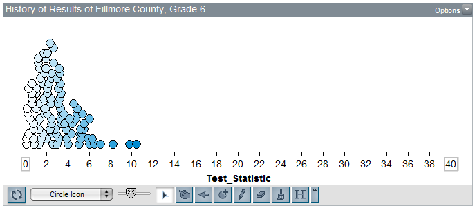
The following graph shows the test statistic computed for each of the 100 simulations carried out under the null hypothesis in Tinkerplots:
Questions:
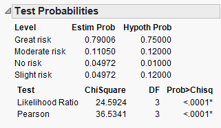
The Test Statistic for the observed data from our sample of Grade 6 students in Fillmore County is 36.54. Is this value consistent with results we would expect to see if Grade 6 students in Fillmore County do not deviate from historical state-wide patterns for the marijuana portion of this question? Explain.
Consider the formula for the test statistic. What would a value near 0 imply? What would a large value imply? Explain.
\[\mathrm{Test\,Statistic} = \sum\frac{\left( \text{Observed} - \text{Expected} \right)^{2}}{\text{Expected}}\]Compute the p-value, make a decision, and write a final conclusion for the original research question.

Note
It can be shown that this test statistic actually follows what is known as the Chi-Square Distribution. This is different from the Binomial distribution presented earlier.
Unlike the binomial distribution, the chi-square distribution is not based on counts and is often skewed to the right.
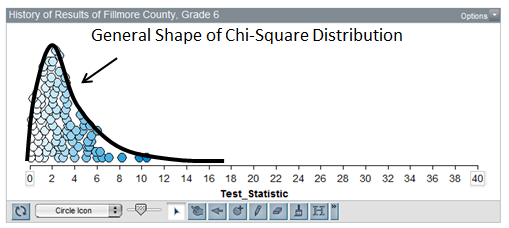
The number of categories is taken into consideration through a quantity called the degrees-of-freedom, typically referred to as the df.
df = # of Categories – 1
This hypothesis testing procedure is often called the Chi-square Goodness of Fit Test and can easily be carried out using most statistical software packages.
Using JMP to find p-values given the raw data
This hypothesis testing procedure is often called the Chi-square Goodness of Fit Test and is also easily implemented in JMP when given the raw data. For example, consider the following data set:
To get the test statistic and p-value in JMP, select Analyze > Distribution. Enter the following:
On the output that appears, select “Test Probabilities” from the red drop-down arrow:
Enter the following:
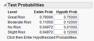
Click “Done” and JMP should return this output:
General Comments Concerning the Confidence Interval for a Single Proportion*:
A confidence interval allows us to estimate the population parameter of interest (note that the hypothesis test does NOT allow us to do this). Therefore, when available, a confidence interval should always accompany the hypothesis test.
Several methods exist for constructing a confidence interval for a binomial proportion. We have considered a method known as the “Wald” interval. Note that this method does not typically perform well for very small sample sizes or when the point estimate is very close to either zero or one. This is because the normal curve does not approximate the binomial distribution very well in these situations. For example, consider the binomial distribution with π = .10 and n = 20:
If our point estimate had been and the sample size had been n = 20, then the Wald method would not have provided us with a very reliable interval estimate of the true population proportion. Other alternatives (such as adjusted Wald intervals, binomial exact intervals, or score intervals) will be more appropriate in these case. One rule of thumb is that as long as and , the Wald interval should work reasonably well. If these conditions aren’t met, you shouldn’t use the Wald method.